Thursday, 19 March 2015

inital t-shirts and tags

so these are my first t shirts designs i think i need to play around with them a little more but quite happy with how they are going

the tags ive just mocked up quickly just to see what it could look like


excuse the bad edited i need to redo only noticed when put on to orange background


stereotypes

A different type of stereotype also involves grouping of individuals. Skaters, Goths, Gangsters, and Preps are a few examples. Most of this stereotyping is taking place in schools. For example:
  • Goths wear black clothes, black makeup, are depressed and hated by society.
  • Punks wear mohawks, spikes, chains, are a menace to society and are always getting in trouble.
  • All politicians are philanders and think only of personal gain and benefit.
  • Girls are only concerned about physical appearance.
  • All blonds are unintelligent.
  • All librarians are women who are old, wear glasses, tie a high bun, and have a perpetual frown on their face.
  • All teenagers are rebels.
  • All children don't enjoy healthy food.
  • Only anorexic women can become models.
  • The elderly have health issues and behave like children.

edited scanned images

so after drawing out my logo and characters i scanned them in to see how they were going,(ive got a tattooed guy wolf one to draw up) and i think there working really well and im pleased with them 
not sure yet needs some work but this will only be going on tags and just the logo will be going to the actual t-shirts

with the logo the edge werent as neat as i wanted it so did end up having to put a black outline on it, it doesnt look as bad as i thought it did and when i put it with the rest of the digital text it helped fit it in.


these guys took me some time to draw up but didnt take 2 minutes to mac up, the only problem im getting is when i transfer them on the illustrater to put them on the t-shirts they go really pixely which im hoping goes away when i print them out. 

i think next im going to try adding a pop of colour cause i think there strong enough as they are but maybe putting the on a brightly coloured t-shirt or making the heads a different colour might make them stand out a little more.

Tuesday, 10 March 2015

research into t-shirt design

really like this one
i like the idea of using black and white with a hint of colour but not a full colour image 

architecture idea

before - fragile - after ( what takes place when it falls down/run down)
feeling insecure - could fall
bright colours
facile looking
sense of community - working together
roman architecture = people got killed in a beautiful setting\
over population - in a landmark eg effiel tower - links with the shooting in paris
could fall at any moment

artist amy casey architectural despoil

''Her pieces are of tangled, rickety, and unstable worlds that are unreal enough to excite the imagination, but realistic enough to hit home. With events in the last decade as any indication, today’s society feels increasingly insecure, as if everything could fall down at any moment; Amy Casey taps into this with a beautiful array of work'' http://weburbanist.com/2010/07/01/amy-casey-painter-of-precarious-worlds/


t-shirt idea - paul davies

hippies = lion
chavs = elephant

drug experimental not meant for this = colour?
paul davies
''Like pages from a space-age Architectural Digest, Paul Davies’ painted houses hover in a surreal semi-state of suspense and beauty. His modernist houses sit amid an ever-changing backdrop of acid-toned skies and inverted reflections in placid swimming pools. The Australian artist’s work draws from a range of influences (the Bauhaus aesthetic and a childhood obsession with Jeffrey Smart to name two). I’d like to call his style Miami mansion meets David Lynch thriller meets Hockney-esque colour blocking. Either way it’s pretty wonderful.'' from itsnicethat.com

logo designs

so i started off with writing out the brand name in different fonts to see which ones i liked and what kind of style i wanted to try

i couldn't decided between thick and thin text so i used both 
i also edited the r so it had something other than just the blue o i did this also as it can be seen a r as its surrounded but letters but actually alone its just a line and a circle/dot and represents what my company is trying to get across of not everything is as it seems


i like the black writing with the white background better than black with white writing

adding the black outline to the o so the style carries on and not just blends in


i also moved everything along from the o as it seemed like everything was squished then the e on the end looked on its own


i wanted to see what it would look like as a stand alone image and if it would be strong enough which i think it is but i don't think it what I'm looking for but encourages me that its strong enough and my use it as something that could go on the back of a tshirt.

i decided not to have a stand alone logo as an image as i like this but think that certain elements could  be used such as the 'r' 


pictures to work from


Monday, 9 March 2015

60s video


more ideas

other drivers
- getting my name wrong
- common names
- children stories = how will they look in the future?
fat
vacant stare
glasses

-blueprint of life
- buildings all looking the same such as empire state building, big bn, eiffel tower
- domestic housing

idea development

- different thoughts, voice over
- dementia = looking through window and not recognise themselves
- so not recognising yourself or recognising whats real
- people don't like being filmed
- scary? multiple screens around room with film whats already there with something artificial/ scary moving around
- create reaction and play at the end= so record retains - lighting problem?
- game you can play wheres the spider etc?

Friday, 6 March 2015

logo - blue orange

so as ive already decided on the brand name to be blue orange as i wanted to show that stereotypes arent always what you expect and not everybody fit in so thats why i decided on the name blue orange because simple as an orange is orange and you cant really get more fitting for a fruit or colour sso i wanted it to contridict itself so i called it blue orange

so i went on to look at what kind of logo, i started by just google searching simple orange logos as i wanted it to be easily recongisable but also something that could be played about with
the problem i found with this except for it not being my own image, is that they were a bit bland and werent in the style of the rest of the designs so im deciding on drawing my own out with a bit more rawness.


Wednesday, 4 March 2015

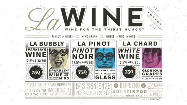
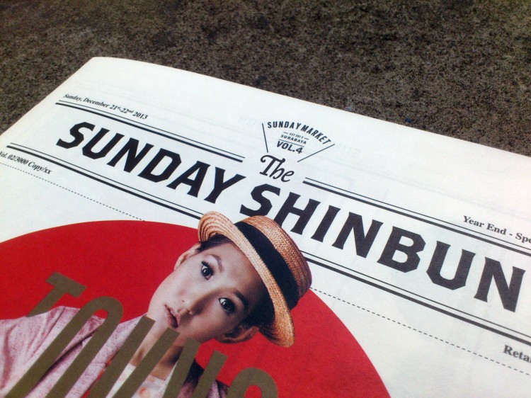
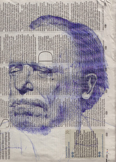
newspaper research

so i started with going for the obvious choice and looking at what newspapers are out at the minute and what works well, i love the uniformed style of the layout with the huge picture in the center of the page, however the header just looks a mess to me and just makes it look like another title and not the title of the newspaper.
this style of heading has worked for hundreds of years and uses the same layout as the one before so i think this layout will have to be something i look into as it obviously works very well for this major newspapers
looking at one thats probably more current with me and people my age are the tabloids but found this style to be more image based so not really what im looking for with this particular project
i wanted to look