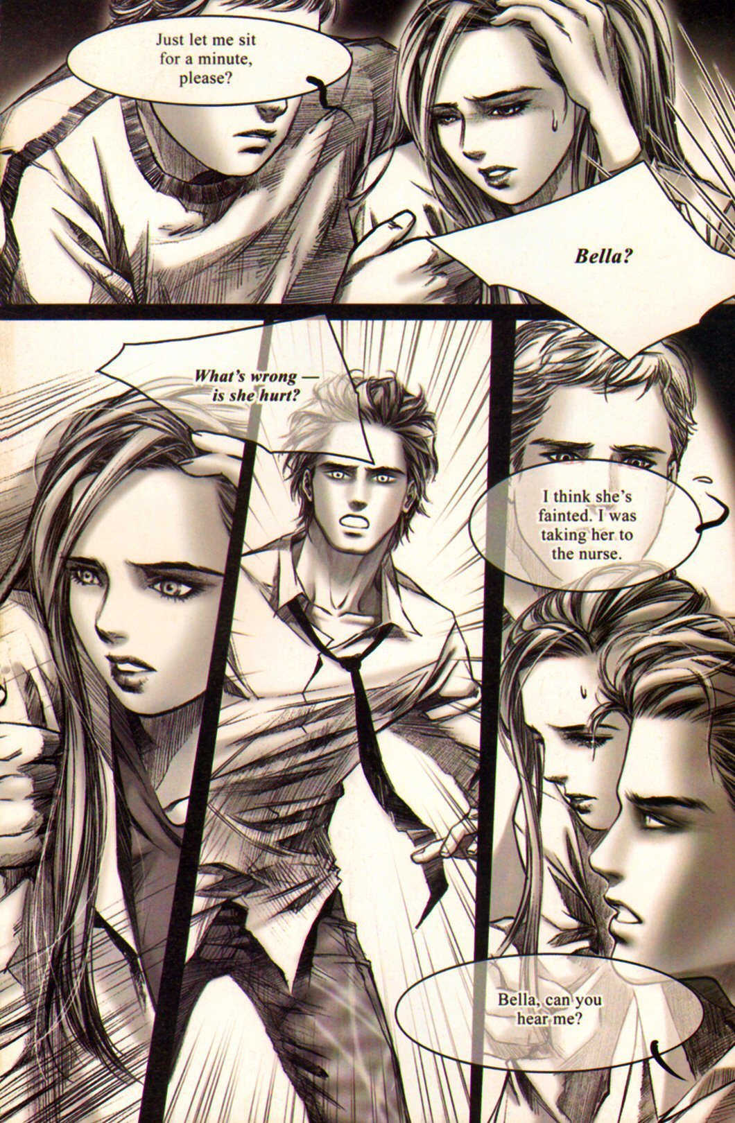
i really like the style of the layout with this certain comic and really wanted to interperate it in my own way as the lines went well with style of my actual drawings. i think the styles worked very well together but maybe next time try some curved lines
i tried using lines as background as this artist has done in this kung fu panda comic and found i didn't work out as well as expected i don't know if it the materials i've used to create it though, anyway i don't this ill be using tis style for my final piece
after deciding on not colour up the background it made me think about different backgrounds i could use and after seeing how well other classmates work come out using photos as backgrounds i thought id give it a try, and as much as it worked for them i dont think it works for me as im aiming at a younger audience and the use of drawn lines are a lot softer and would appeal more to young teens as research suggested.
moving on from just colour i wanted to play around with text and see if the contrast of hand drawn and computerized style work well together, i think it does work just need to find a better font to go better and decided again and colour in the background and just keeping it to greys and hints of colour, this would also make it cheaper to produce if this was to be created for real
i got the idea of using felt tips and water from this guy, i thought i was a good way to experiment with the simplest things but instead of splattering them i wanted a much smoother look so used them as in lines them added water to soften them, this was just a quick sketch to see how they would work i later decided that itdidnt work for the style i was trying to create but do like the technique and will probably come back to it in the future
going back to looking at research to ensure that there isnt anything ive missed but also different styles to ensure ive found the one i want, so i decided to look into graphic novels where they are a lot more detailed compared to the comic styles ive previously look at and by doing this i know that i do want to keep it simple so my target audience dont get bogged down my too much going off so they want to look at it for enjoyment. the thing i did take away from this is that i like the different shaped speech bubbles for different emotions i think this works very well as i dont want to be have to add writing below the boxes to explain whats happening and let the imagery do it for me.
i like there use of a thick outline and think this will be the way i end up colouring them up by drawing the outlines then adding the colour later, i also like the way they use thinker lines round the edges but for detail using thinner lines
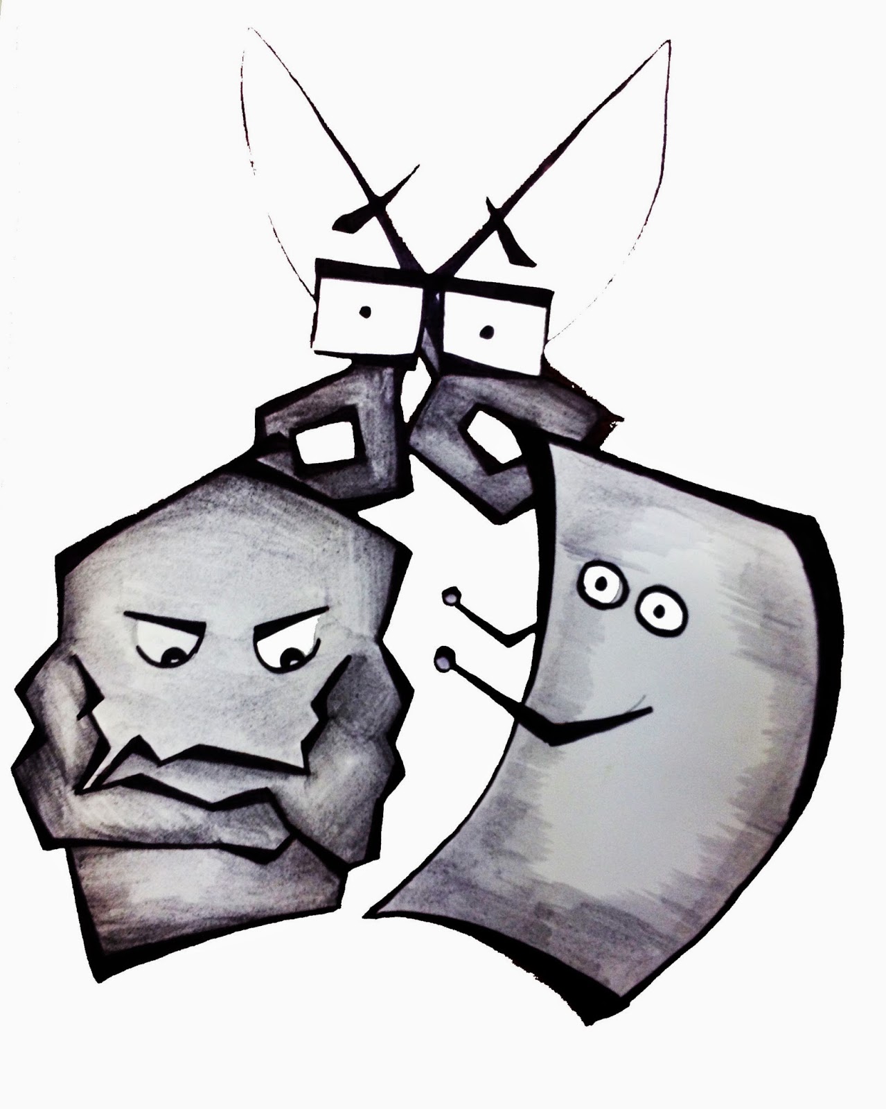
when researching where rock paper scissors came from i found it was china and to begin with i tried interpreting it into the character making them into sumos and such like but found that this didnt work so decided on using the lines of the chinese letter as to influence the style of the comic. i think my favourite is the one saying kaneiwa but making the ends slightly thicker
when looking into rock paper scissors i found the hand signals and thought of the possiblilty of there being a logo so that this shows the progression of what this comic could turn into
i wanted to see how different materials would work when transferred on to photoshop, the first two images are graphic markers which i think worked really well and the others are felt tip with water, with them i found when they were tranferred on to the computer they lost the fluidity and didnt work as well
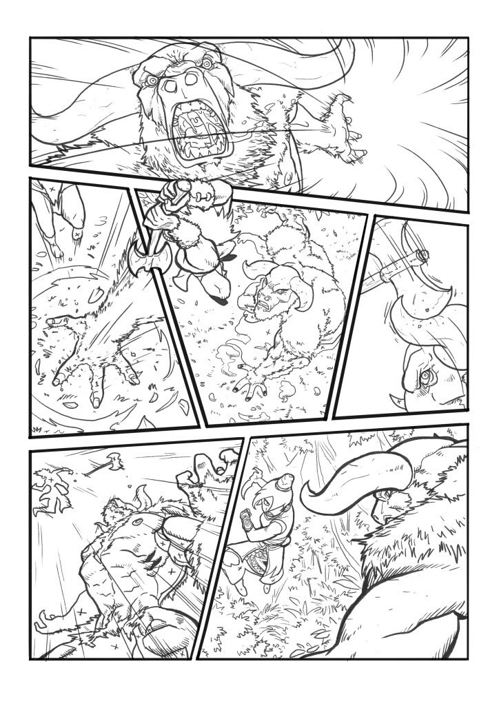
when looking at comic layouts i wanted to find one that also considered the story and the action i wanted it to have so i compared two different styles the top i found was a mch more sutible choice for my particular story as the edgy lines showed action whereas the other where the images overlapped showed a much more subtle effect than what i was aiming for whereas i do like inn the last image i found in the page numbered 5 where the image does overlap but i think that kind of style is in a lot more detail than i was planning to go into as i wanted my story to be for young teenages and i would need to be short so not to lose there attention but get the story across enough that it makes an impact.
looking into more group superheros but maybe not the typical ones, i looked into kung fu panda, i wanted to see how they incorporated the chinese theme into the story and they did this by the animals and the fighting skills of karate. after searching the comic strip i like the way there in black and white and would like to look into doing something in just black and white.
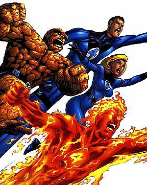
first thing i decided to do was to look what kind of comics there already was out there and see which were most popular and also to see what made it to the big screen. it happened to be super heros so after choosing rock paper scissors i started looking into them. id like my comic strip to have the same kind of story lines as fantastic four as i like the aspect of the characters working together, as im using objects i think ingenerals there just aimed at a younger audience so i think added the moral of working together in there makes the story of some use but to also introduce children into comics.
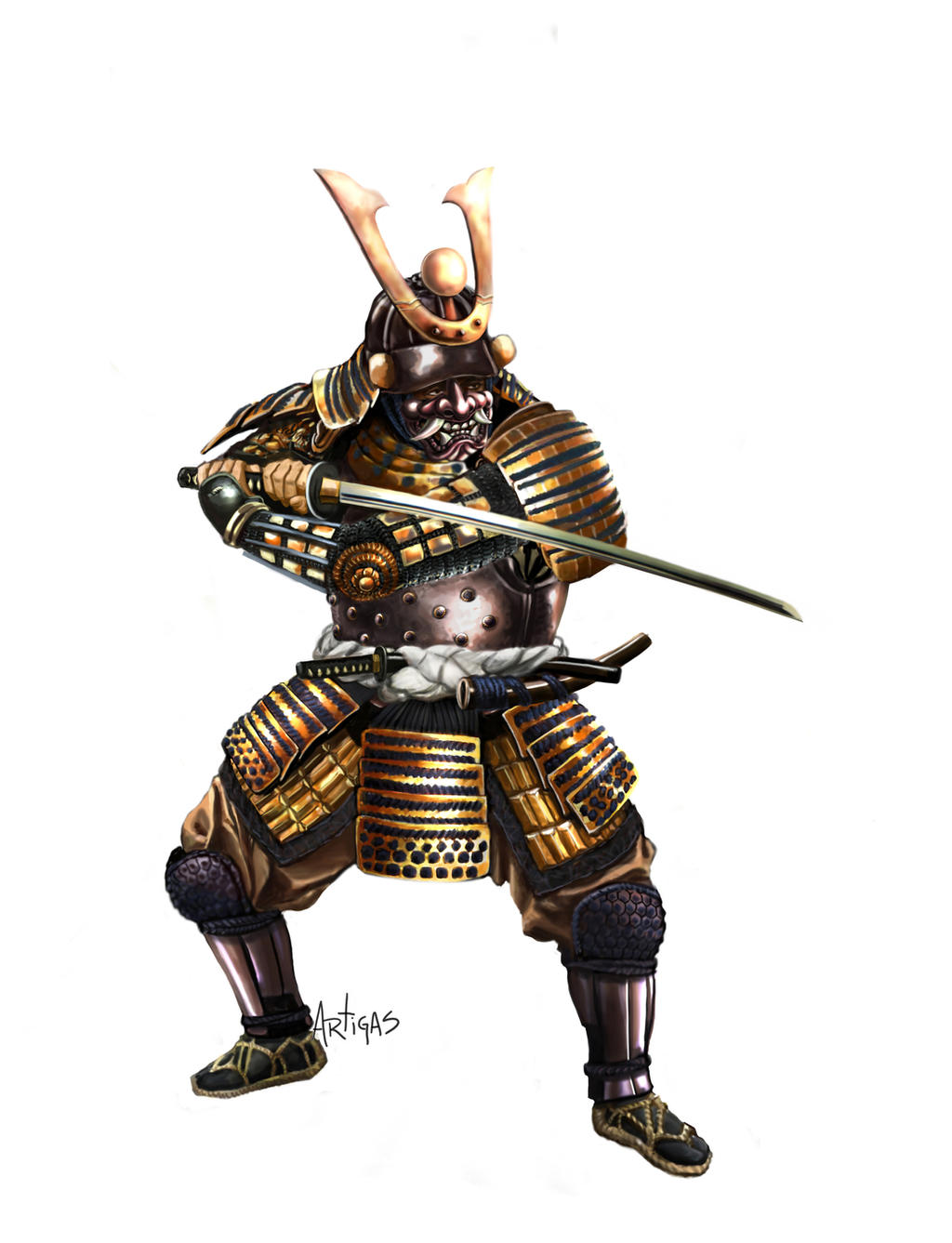
my intial thoughts when i first found that the game rock paper scissors originated from chine was to change the charaters into the difference fighting styles such as turning the rock into a sumo, the scissors into a samurai and paper into karate but after looking into the drawing of the characters and trying the different styles on them i found it made it too detailed and decided against it, now i want to try looking into making the design look more chinese by using lines that go from thin to thick like a lot of the chinese lettering does
after sketching a few ideas out at college i decided to see what they would look like if i edited them in photoshop, only spending 5 mins adding colours and changing the lighting made a huge change, it has also gave me the chance to see what needs more time on such as the scissor character and also just to tweek certain areas of the look im wanting


 i like there use of a thick outline and think this will be the way i end up colouring them up by drawing the outlines then adding the colour later, i also like the way they use thinker lines round the edges but for detail using thinner lines