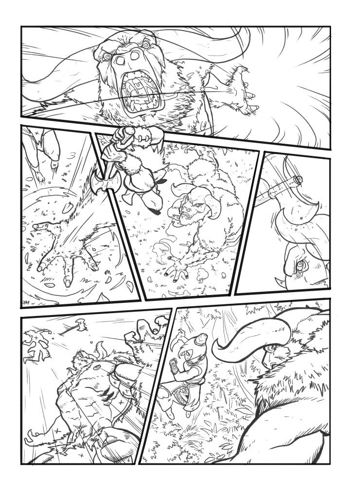
when looking at comic layouts i wanted to find one that also considered the story and the action i wanted it to have so i compared two different styles the top i found was a mch more sutible choice for my particular story as the edgy lines showed action whereas the other where the images overlapped showed a much more subtle effect than what i was aiming for whereas i do like inn the last image i found in the page numbered 5 where the image does overlap but i think that kind of style is in a lot more detail than i was planning to go into as i wanted my story to be for young teenages and i would need to be short so not to lose there attention but get the story across enough that it makes an impact.


No comments:
Post a Comment