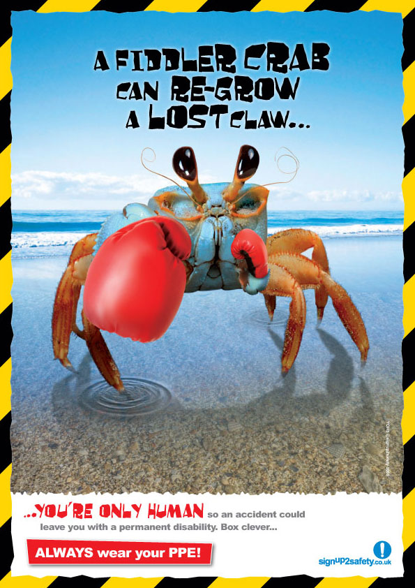
animal related - what i like about this is the fact that a we aren't as invincible as we think, and even the smaller creatures are better in certain environments than us. the problem i see with is is the most important information is too small and could be made bigger and bolder for easier to see

factual information - positives about this style is that it gets the points across simple and easy. i feel the negatives is that it may just blend in with other posters as theres no big bold picture to gain attention.

center image - i like the layout of this poster and like the use of blending the image in the background so the attention is where you want it. i just don't this the typography styles work well together and the colours just make it look plain

oriental style- i like the idea of having a particular style on a poster to bring it all together but also to make it a little different i also like the mix of photography and graphic imagery but the only problem with using this style is what has it got to do with safety and having to make a link between them without it being obvious
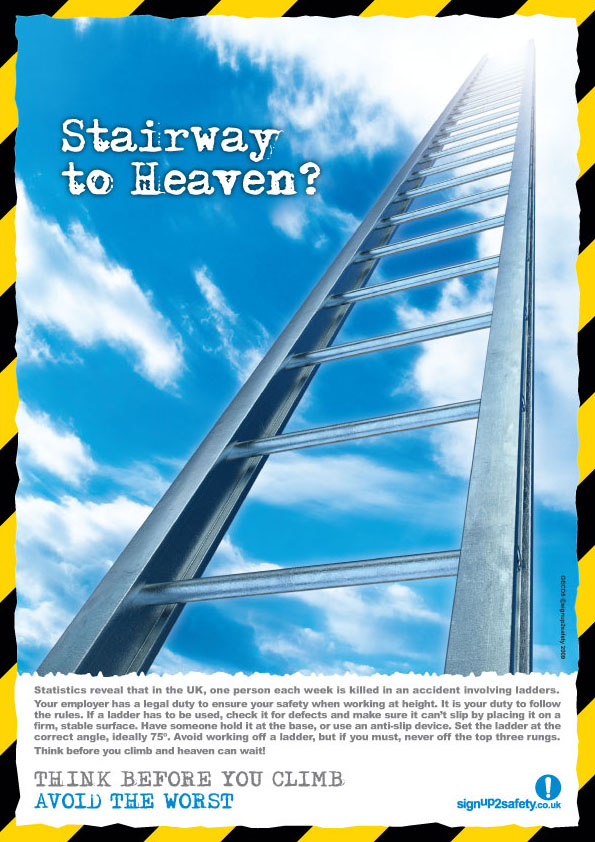
main image - with this i like the edging as it instantly makes you this of safety and knows what its about the problem i find is that it seems a little plain maybe the image need more going off in it or details of the text adding on to it.

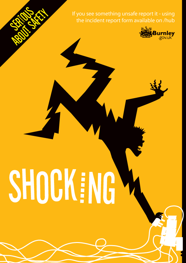
cartoon - i love the idea of making a cartoon out of a certain item of clothing or part of the body and this there are many possibilities for this particular style i also like the simplicity of it and feel it doesn't look bland, i do however think that maybe some details could be added to the bottom just to re enforce to safety notes.
graphic style - with this i find that it has the extra information added to the top but is missing the details in the main title. i like the idea of only using 3 - 4 colours this would also make it cheaper to reproduce.
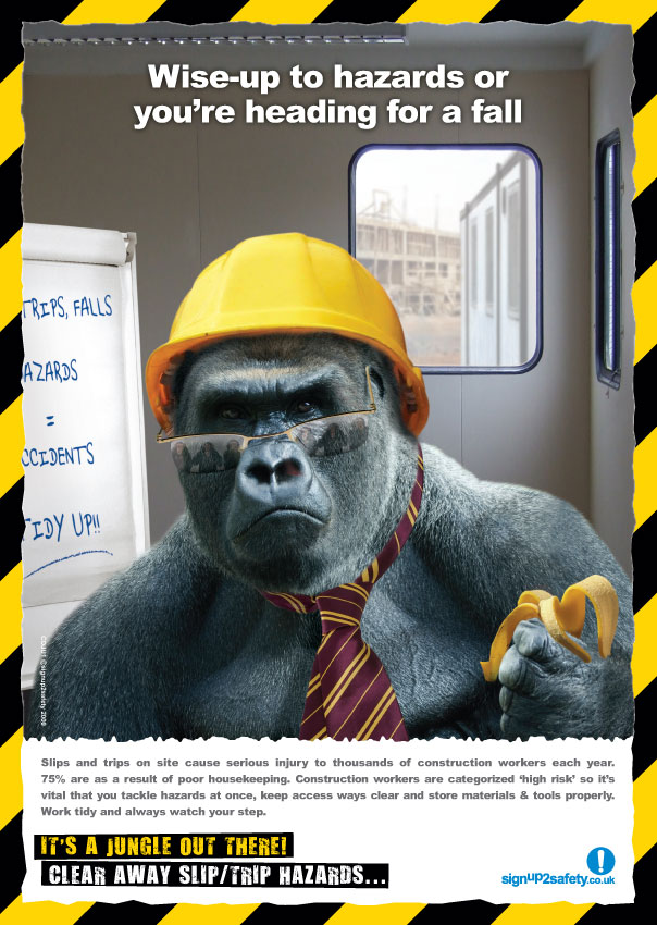
character - i think having a character would be a good idea as this would link all the posters together and give it a style however i think the heading could be made bigger and have a catchier heading.
I discovered your this post while looking for information regarding blog-related research ... It is a good post .. keep posting and updating information.CE marking
ReplyDelete