final ideas for healthy living
Wednesday, 22 October 2014
Monday, 20 October 2014
bill viola - the crossing
Tung Nguyen says this piece is about balance. "The concept of balance is presented through opposite concepts that each alone is an extreme that can only be balanced by one of the other extreme. Left - right, fire - water, red - blue, warm - cool, hot - cold, bottom - top, and so on. The viewer can even sense the artist's desire for moderation, for compromise, and the message that the extremes are what harming us (burnt by fire or washed away by water) and we need a common ground to survive."
i like the double screened effect and i think this shows how mutiple screens can work together without it being the same clip running but also shows that they need to be linked quite closly for the video to work
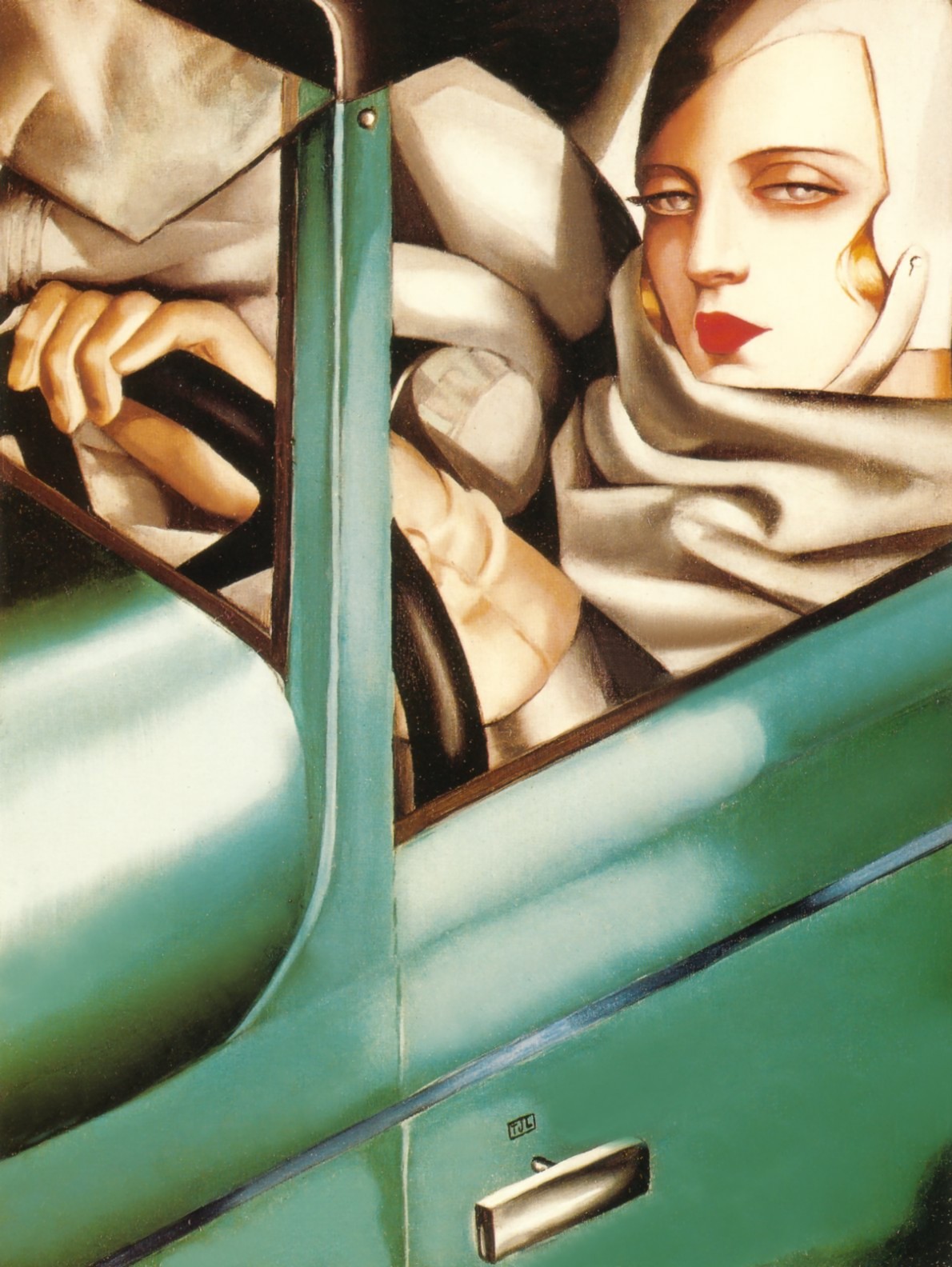
art deco - Tamara de Lempicka
Tamara de Lempicka was born Maria Gorska in Warsaw, Poland, in 1898. Introduced to art at the age of 12, her mother had paid for an established painter to create her daughter’s portrait. Unsatisfied with the results and convinced that she could do better herself, de Lempicka set out on a task that would subsequently carve out a successful, if tumultuous career. She married young and gave birth to her only child — a daughter named Kizette whilst living in St. Petersburg. Forced to leave the city as a refugee during the Soviet Revolution, she fled to Paris through financial necessity and learned to paint, exhibit and sell her works.
http://theculturetrip.com/europe/poland/articles/art-deco-icon-the-alluring-mystique-of-tamara-de-lempicka/
http://www.delempicka.org/
art deco and more
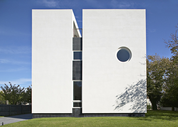
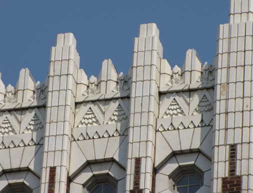
art deco first appeared in france after world war 1, and spread world wide in the 1920's and faded out after the world war 2.
it combines traditional patterns with influences from machine age imagery and materials. it includes rich colours and geometric shapes from new technologies. art deco ran to symmetry rather than asymmetry that was becoming popular
- simplified arts and crafts
- coined 1960s
- modern world
- new products in affordable materials due to new machinery - production lines
- 1920s need for escape
- flapper girls
- futurism - italy manifesto 1909
- vortices - Britain - short lived
- 1914 - geometric towards abstraction
- independent alternative movement in an image
- jacob epstien - rock drill - masculine
- taken over by machine - different feeling after war - lot more negative
- gaudier brzeska - killed aged 24 in ww1 lot of work done
- 1925 pris exhibition after ww1 Frances ambition
- suffragettes 1897 (1903)
- emily Davison died horse got vote in 1918
- less feline fashion world events tutankhamun style = fashion style for women cleopatra film (early 1920s)
Sunday, 19 October 2014
pre - raphaelites - lizzie siddal
Lizzie siddal was used as a model for the brotherhood but there were controversy of this was she was auburn haired which at the time was linked to witch craft and also seen as prostitution.
the pre Raphaelites used Lizzie to model and doing so drew her true nature not the character she was suppose to be portraying.
A gentleman has installed his mistress (known to be such because of her absence of a wedding ring) in a house for their meetings. As they play and sing to Thomas Moore's Oft in the Stilly Night, she has a sudden spiritual revelation. Rising from her lover's lap, she gazes into the sunlit garden beyond, which is reflected in the mirror behind her. The mirror image represents the woman's lost innocence, but redemption, indicated by the ray of light in the foreground, is still possible. Intended to be 'read', the painting is full of such symbolic elements. The cat toying with the broken-winged bird under the table symbolises the woman's plight. A man's discarded glove warns that the likely fate of a cast-off mistress was prostitution. A tangled skein of yarn on the floor symbolises the web in which the girl is entrapped.
pre - Raphaelites -renaissance
the renaissance was a cultural movement that started in Italy in the late middle ages and then spread out to the whole of Europe and lasted till the 17th century.
it was the development of linear perspective, a more natural reality in paintings. this became a gradual but widespread educational reform and is still taught today. it used strict rules of compositions marking to thirds so the painting became ridged and and staged normally having a religious figure being the centre of perspective.
they worked out using these rules from a device called the camera obcsura this worked as an eye and flipped the image but also used grid lines. this was the same time as divinchi.
Saturday, 18 October 2014
gerry stormer
love his work just wish he stepped outside the 'box' a little and broke some rules rather than sticking to precise mathematical folds but in any case i do feel inspired and has given me some ideas for where i want my project to go
“Post-Digital Printed Augmented Reality”
http://berglondon.com/blog/2010/10/11/post-digital-printed-augmented-reality/
this post really interested me with how he linked the artists and other things together
this post really interested me with how he linked the artists and other things together
product design
using the same technique for product deign, kind of reminds me of what mine looked like
https://www.behance.net/gallery/7272913/Origami-Lamp
https://www.behance.net/gallery/7272913/Origami-Lamp
architectural sculpture?
this was my take on a little project our tutor set us and at first i just couldnt get hang of it as you can probably see from my first attempt but after trying to connect with the project and thinking what i want to do after college i found a way around it and did it more my way and not what i thought was wanted from it. i think they worked pretty well to say i did it in less than 5 mins just need to develop it a little more.
Wednesday, 15 October 2014
evaluation
i used my newspaper layout for my evaluation for my health and safety poster.
i tried to make it as realistic as possible using research to work from. i also used what i learnt from the poster with spacing and fonts and what would be appropriate for a newspaper. the only thing i don't think works when it comes to this layout is the colours don't work together and could possibly be change to fit the images, however i didn't do this as real newspapers don't do this every time they have a different image on there front cover so i left it as it was.
i tried to make it as realistic as possible using research to work from. i also used what i learnt from the poster with spacing and fonts and what would be appropriate for a newspaper. the only thing i don't think works when it comes to this layout is the colours don't work together and could possibly be change to fit the images, however i didn't do this as real newspapers don't do this every time they have a different image on there front cover so i left it as it was.
Tuesday, 14 October 2014
review - hygiene (wash your hands)
one of my final posters for the healthier and safety project. find for how simple it was to to put together i came out quite good and makes a lot of impact and gets the point across. i find with it being so simple that attention to detail was more important than ever as any mistakes or spacing errors would stand out like a sore thumb. also the size of the text were an issue as i wanted the tex to be the main focus and the image an after thought that enforced what the text was saying
videos
nam june paik - exhibition 2009 new York
at first I started looking at just the videos and his particular work didn't really interest me but after coming across his exhibition in new York it caught my attention as to how he presented his work. I really liked the mix between the older styling of the video and the modern theme of the tvs and projections.
peter campus - three transitions
Campus uses basic techniques of video technology and his own image to create metaphors for the psychology of the self. In the first "transition," Campus records with two cameras simultaneously on either side of a sheet of paper to achieve visual illusion: he appears to stab himself in the back, climb through his own body, and emerge whole on the other side. In the second exercise, Campus uses the effect of chroma-key to achieve a strrong effect. He wipes his face with his hand and, in doing so, "erases" its surface — only to reveal another image of his face underneath. Finally, in a conclusion, he appears to burn the living image of his face (as if it were a photograph), leaving only blackness.
i think thi video shows the feeling of not being comfortable on your own skin but also the impression other thing have on you. i think the performer tries to expose the illusions the artist has set up and this could also be the same as the media showing the perception that they think is right but also people underneath trying to break through
Steve McQueen Retrospective at Schaulager Basel
different text
my first attempt at the layout for my health and safety posters. i found the writing didn't fit and give enough impact and the image weren't strong enough for this set up.
arts and crafts movement
The Arts and Crafts movement was an international design movement that flourished between 1880 and 1910, especially in the second half of that period,[1] continuing its influence until the 1930s.[2] It was led by the artist and writer William Morris(1834–1896) from the 1860s onwards.[1] It was inspired by the writings of John Ruskin (1819–1900) and Augustus Pugin (1812–1852), although the term "Arts and Crafts" was not coined until 1887.[3]
The movement developed first and most fully in the British Isles where the industrial revolution was happening at the time,[2] but spread across the British Empire and to the rest of Europe and North America.[4] It was largely a reaction against the perceived impoverished state of the decorative arts at the time, and the conditions in which they were produced.[5] It stood for traditional craftsmanship using simple forms and often applied medieval, romantic or folk styles of decoration. It advocated economic and social reform, and has been said to be essentially anti-industrial.
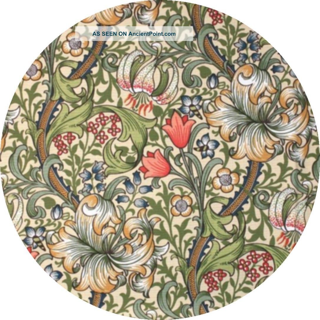
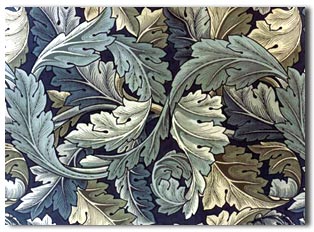
William Morris was a leading member of the Arts and Crafts Movement. He is best known for his pattern designs, particularly on fabrics and wallpapers. His vision in linking art to industry by applying the values of fine art to the production of commercial design was a key stage in the evolution of design as we know it today.
William Morris was an artist, designer, printer, typographer, bookbinder, craftsman, poet, writer and champion of socialist ideals.
Subscribe to:
Comments (Atom)


